What’s not to like about CC?
All images © 2020 Chris Culy
One of the great things about using a computer to help create art is that it is easy to experiment with different aspects of the image. In particular, I can change the colors used in an image and create a new image with just a few clicks. Since Cyclartcy uses small bits of color, much as Pointillism does, we can readily see the effects of color combinations, seeing the theories of color perception in practice. While that is interesting in and of itself, what I also find fascinating is the difference in overall perception of the patterns depending on which colors are used. Let’s get started.
As always, I have used a larger version of this photograph to create all the images here. As a reminder, the results with this smaller image would be different from those given here.
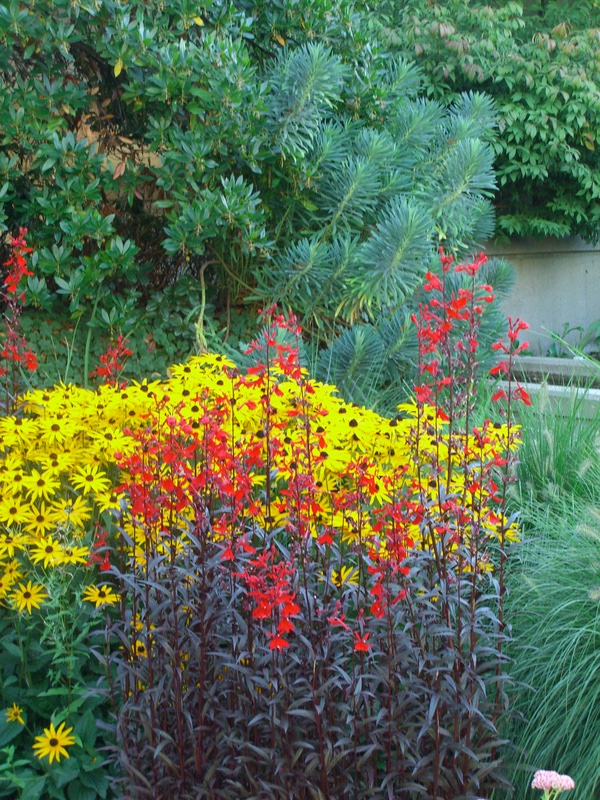
Flowers in Vancouver, British Columbia. © 2007 Chris Culy
To review, recall that Cyclartcy is a way to create art using arbitrary numbers generated from a photograph: we choose a property of the pixels and then calculate numbers from that property. Furthermore in Cyclartcy the sequence of pixels from which the numbers are calculated is determined by the same property. Each property has one or more signatures, which are used in constructing the output images. Finally, we saw that the width of the output image determines the patterns that we see in the image. OK, enough of the review. Let’s get down to it.
All the Cyclartcy images here have the same basis: I’m using the hue property, the signature with a length of 1530, and an output width of 354. Here’s the standard blue-yellow version of the signature, where blue is used if the arbitrary number is less than 1/2 and yellow otherwise:

And here’s the corresponding Cyclartcy image with width 354 (by the way, these will look better on a bigger screen than your phone):
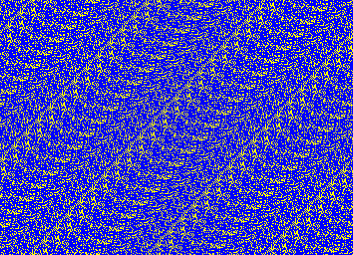
(1) Cyclartcy: Arbitrary From Flowers HUE-354-BY
For the rest of the post I will be using a version of the Red-Yellow-Blue (RYB) color model, which has been used by many artists, including Josef Albers, a prominent color theorist. Here’s the blue-yellow image using this color wheel.
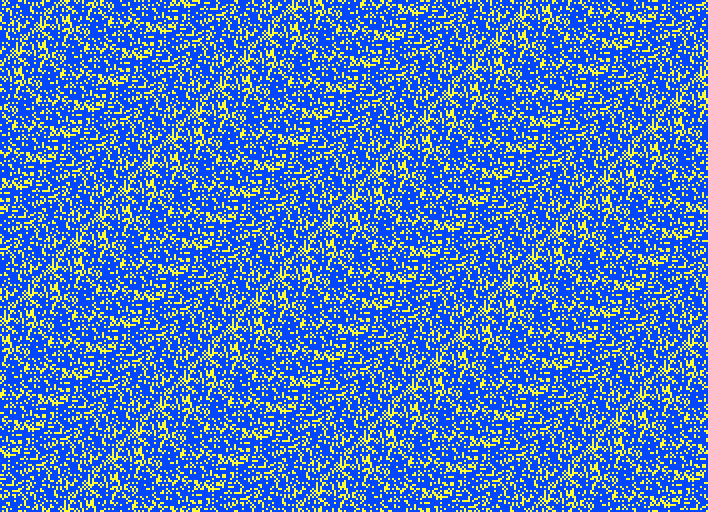
(2) Cyclartcy: Arbitrary From Flowers HUE-354-RYB-BY
Remember that I chose blue and yellow because they are complementary colors. (Van Gogh often used complementary colors.) Another pair of complementary colors are red and green, so let’s replace blue by red and yellow by green (I prefer the blue-yellow version, personally.)
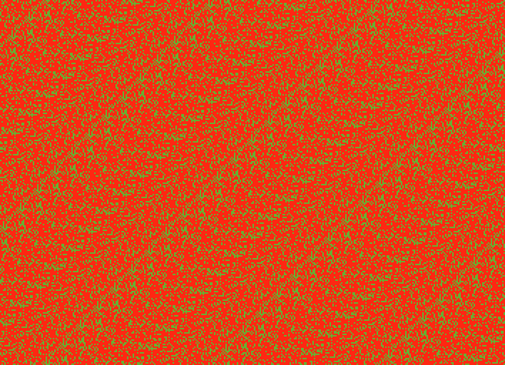
(3) Cyclartcy: Arbitrary From Flowers HUE-354-RYB-RG
In addition to complementary colors, there is a notion of adjacent colors. What counts as adjacent depends on how many colors are in the color wheel, but I’ll stick with the primary colors, so that orange is the color adjacent to red. Replacing green by orange we get (#4). Ah…, that’s better!
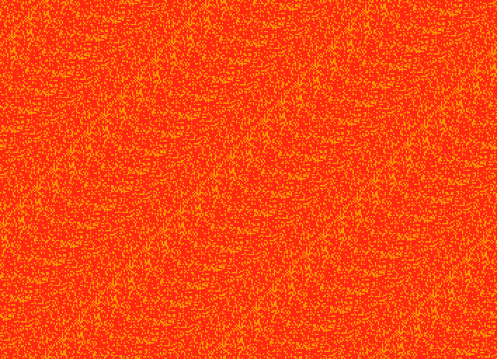
(4) Cyclartcy: Arbitrary From Flowers HUE-354-RYB-RO
To me, the red background (4) is brighter or lighter than the same red background in (3). The reason is that green is darker than the orange, and that influences our perception of the adjacent red. Since white is the brightest color, the red should seem even brighter if we replace the orange by white (it does to me):

(5) Cyclartcy: Arbitrary From Flowers HUE-354-RYB-RW
Similarly, the red background should seem darker if we use black as the other color. (I think it does.)
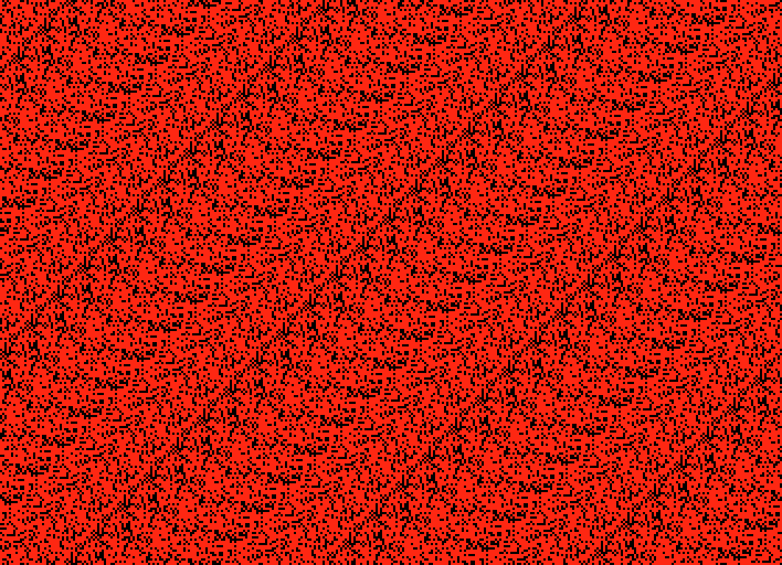
(6) Cyclartcy: Arbitrary From Flowers HUE-354-RYB-RK
Another effect, for me at least, is that the black points seem more distinct than any of the second colors (yellow, green, orange, white). I don’t know why that should be.
I have given some other examples using more than two colors, so let’s add yellow to our red-orange combination, giving us three adjacent colors. This means that if the arbitrary number is less then 1/3 we use red; if it’s between 1/3 and 2/3 we use orange; and if it’s greater than 2/3 we use yellow. Here’s what the corresponding signature looks like:

And here’s the corresponding Cyclartcy image:
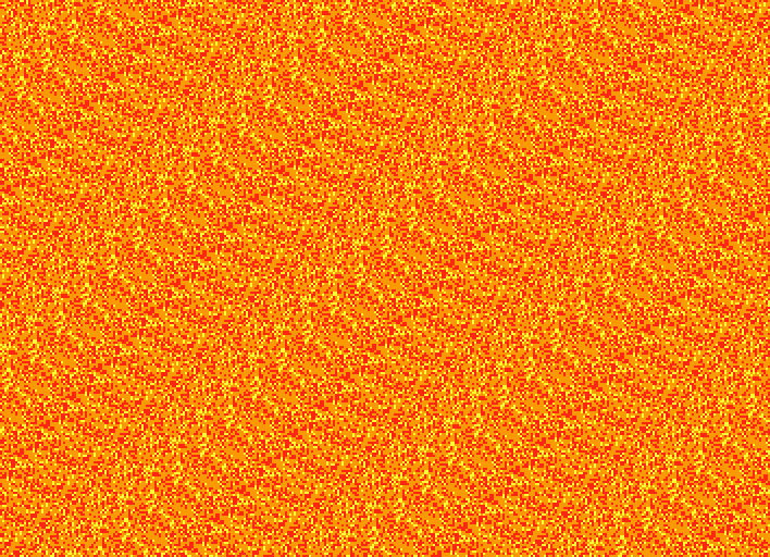
(7) Cyclartcy: Arbitrary From Flowers HUE-354-RYB-ROY
The first thing to notice is that the pattern in (#7) seems slightly different from any of the 2-color combinations. This makes sense, since instead of having just 2 distinctions (colors), we now have 3 distinctions (colors). For me, another thing to note is that (#7) seems denser than any of the others, with the individual points more difficult to distinguish, probably because we have lots of adjacent colors (red and orange, orange and yellow) next to each other.
Since the three colors are ordered (red < orange < yellow), we have 5 more permutations of the order of the colors. Here they are. (They each have corresponding signatures, but I won’t give them here.) Look for differences in how the pattern seems.
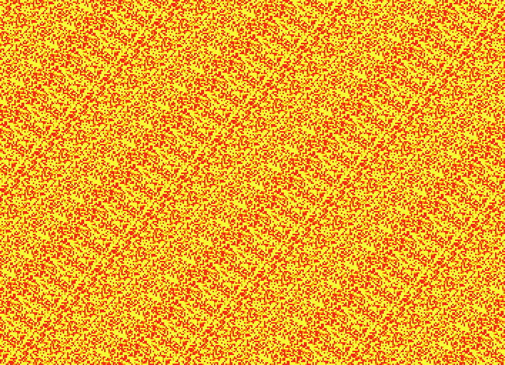
(8) Cyclartcy: Arbitrary From Flowers HUE-354-RYB-RYO
red < yellow < orange
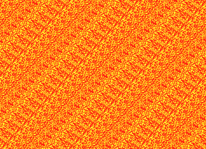
(9) Cyclartcy: Arbitrary From Flowers HUE-354-RYB-YRO
yellow < red < orange
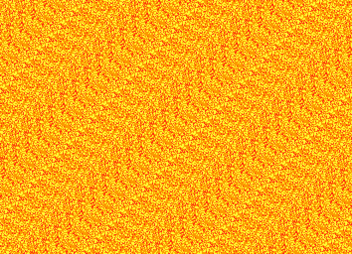
(10) Cyclartcy: Arbitrary From Flowers HUE-354-RYB-YRO
yellow < orange < red
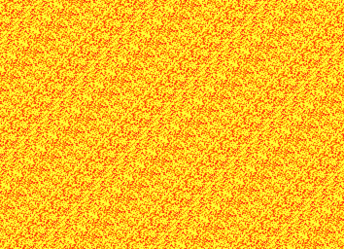
(11) Cyclartcy: Arbitrary From Flowers HUE-354-RYB-YRO
orange < yellow < red
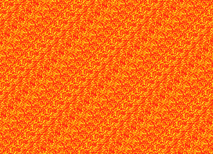
(12) Cyclartcy: Arbitrary From Flowers HUE-354-RYB-ORY
orange < red < yellow
For me, the patterns differ subtly across the color permutations. I’m assuming that is due to which colors end up next to each other, with red-yellow providing the most contrast, since they are not adjacent colors in the color wheel.
Finally, just for fun, let’s add in the other 3 primary colors:
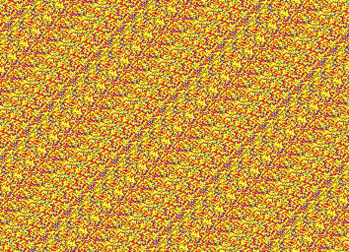
(13) Cyclartcy: Arbitrary From Flowers HUE-354-RYB-ORY
red < orange < yellow < green < blue < purple
Hmm, we may have gone a step or two too far. But, on the other hand, (#13) is the most like Op Art, so there’s that.
There’s lots more we could do (and I have), such as having unequal proportions (like red < 1/3 < orange), or having the same color in multiple positions (like red < 1/3 < orange < 2/3 < red), which also can result in unequal proportions as in that examples (but we could also have equal proportions as in red < 1/4 < orange < 1/2 < red < 3/4 < orange).
But, I think that’s enough to give you at least a glimpse into the vast possibilities of colors in Cyclartcy. It can be overwhelming, so come back and take another look!