Cycling around modern art …
All images © 2020 Chris Culy
Here’s something to get us going on our trip:
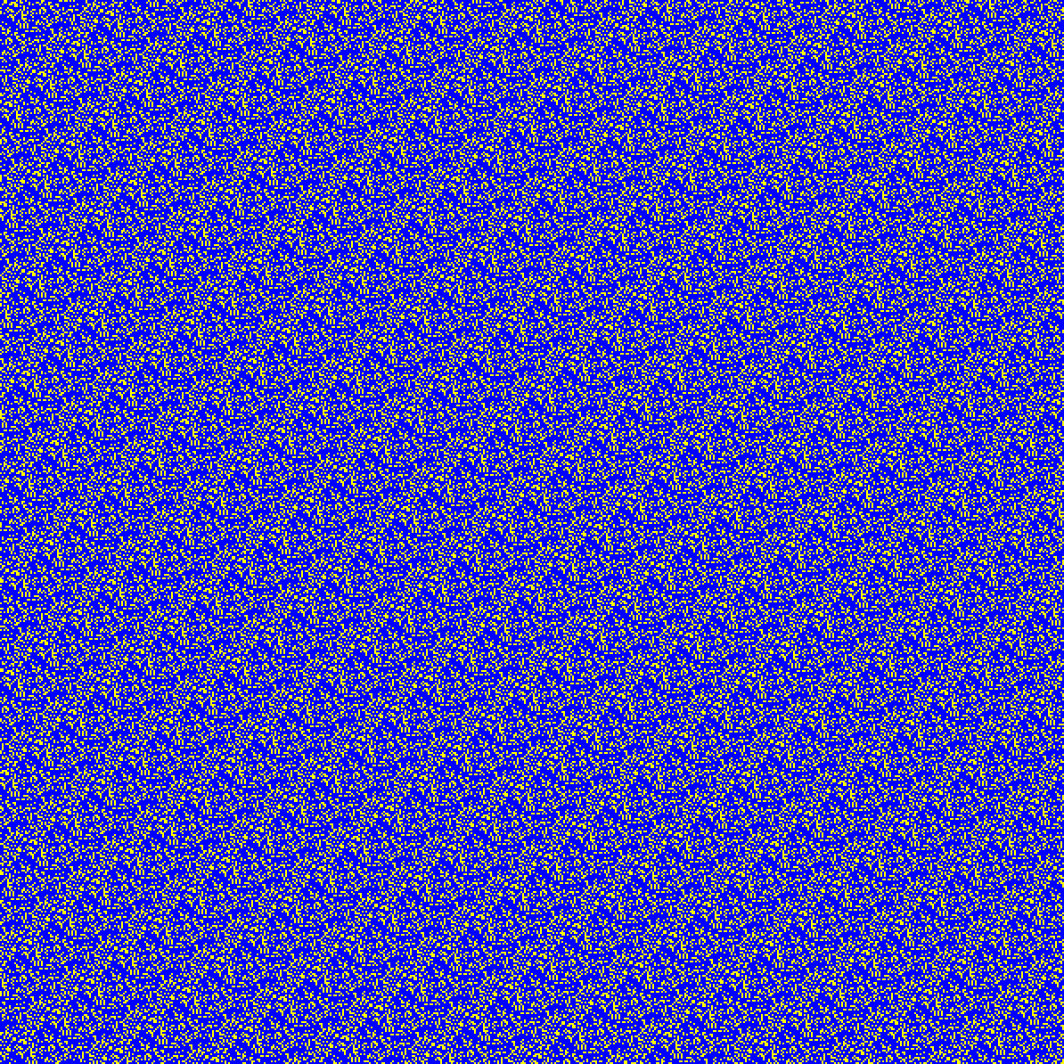
Cyclartcy: Arbitrary From Flowers LUM-BY
Previously I showed how we could use photographs to generate sequences of arbitrary numbers that we could then use to create new images, ones that were more interesting than images created from purely random numbers. Truth be told, I didn’t find those images that exciting, and I thought I could do better at generating sequences of arbitrary numbers. The image above is an example of my new approach. I think it’s much more interesting than the previous images. Here’s a small version of the original photograph (the same one I used previously), which is the basis of all the images in this post.
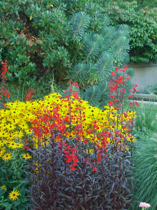
Flowers in Vancouver, British Columbia. © 2007 Chris Culy
While I’ll save the gory details for a separate post, the new procedure finds cycles of points in the original photograph, according to the chosen property. In the above image, the luminance (brightness) of the pixels in the photograph is used, and a cycle of 1013 points is used. Using the same blue-yellow coloring as before (blue if the pixel is less than the middle of the brightness range in the photograph, yellow otherwise), this is what that cycle looks like:

Arbitrary from Flowers, luminance signature 1013
Since the cycles are an inherent aspect of the properties of the pixels in the photograph, I think of them as signatures. It turns out that a property can have (and seems usually to have) multiple signatures. Here’s a short one for luminance for that same photograph (there are 6 different signatures for luminance in this photo):
![]()
Arbitrary from Flowers, luminance signature 16
How do go from those signatures to images like the first image above? The idea is to select a desired width, then lay out the signature band left to right, and when the signature extends beyond the right edge, we wrap it around to the left again. We lay out another copy of the signature band where the first one left off, which effectively shifts the signature, similar to the way twill works in weaving. We continue this to whatever height we want. In that first image, I chose the width and height both to be 597 (and for this output, I doubled the size of the output). More information will be in the gory details. Since this new approach to artistic images involves repeating cycles, I call it Cyclartcy.
I originally chose blue and yellow since they are complementary colors (and because I like the combination), but there are other pairs of complementary colors, like red-cyan, and magenta-green.

Cyclartcy: Arbitrary From Flowers LUM-CR
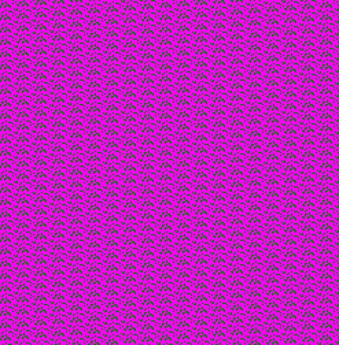
Cyclartcy: Arbitrary From Flowers LUM-MG
In looking up complementary colors, I came across Charles Blanc, an early influential theorist about color and painting. (He was French, and blanc means “white” in French, which I find amusing, since he was a color theorist.) He advocated for one kind of color wheel, and it’s interesting to use (an approximation of) that. We’re also not limited to luminance as the pixel property. Here I use hue as the property, with adjacent colors from Blanc’s color wheel (one of his recommendations).

Cyclartcy: Arbitrary From Flowers HUE-PB
I don’t know about you, but I think M. Blanc was on to something. He was associated with the Divisionism school of art, which worked with adjacent shapes of colors, as opposed to Pointillism, which worked with adjacent points of colors. Cyclartcy is somewhere in between Divisionism and Pointillism. Although the input to the arbitrary numbers are the pixels and (mathematical) points of the original photograph, the cyclartcy images consist of shapes, since square pixels of the same color fuse together to form shapes, which you can see more clearly if you zoom into any of these cyclartcy images. Here’s the top left corner of that previous image, enlarged.
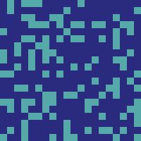
Cyclartcy: Arbitrary From Flowers HUE-PB, enlarged excerpt
Of course, Divisionists (and Pointillists) used more than two colors, and we Cyclartcists can too. Here’s an example with 3 of Blanc’s adjacent colors, using the “green” property of the photograph’s pixels.

Cyclartcy: Arbitrary From Flowers GREEN-ROY
I really like the textured feel of these last two.
If you look at these examples for a little bit, they may start to play tricks on you. Here’s another one, using the combined RGB (red-green-blue) properties of the photograph’s pixels:

Cyclartcy: Arbitrary From Flowers RGB-BGC
For me, the lines, especially the light blue ones, seem to be wavy (left-to-right) and not necessarily parallel. In fact, if you were to connect the dots (as it were), you’d find that the lines are straight. Optical illusions, as this is, are the foundation of the Op Art movement. While I’ve enjoyed optical illusions since I was a kid, when I first saw Bridget Riley‘s Op Art paintings, I was blown away. Absolutely amazing! It was fun to stumble onto this kind of Op Art in Cyclartcy, serendipity as my father likes to say. Here’s another one in the spirit of the original black and white Op Art.
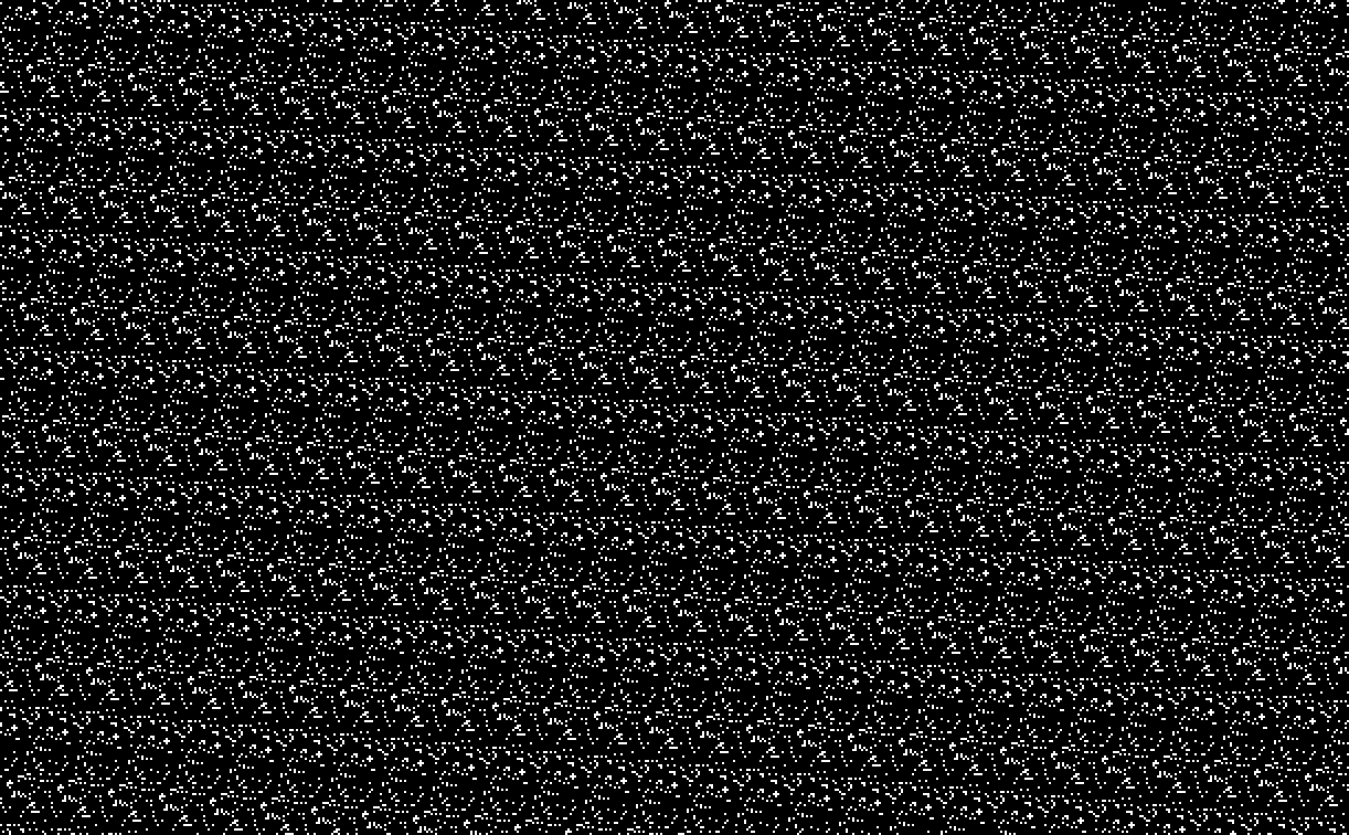
From late 19th century color theory, Divisionism and Pointillism, to 20th century Op Art, all via a type of 21st century conceptually-based generative art, Cyclartcy. Quite a fun trip!
I’ll leave you with one final tantalizing souvenir of that trip:
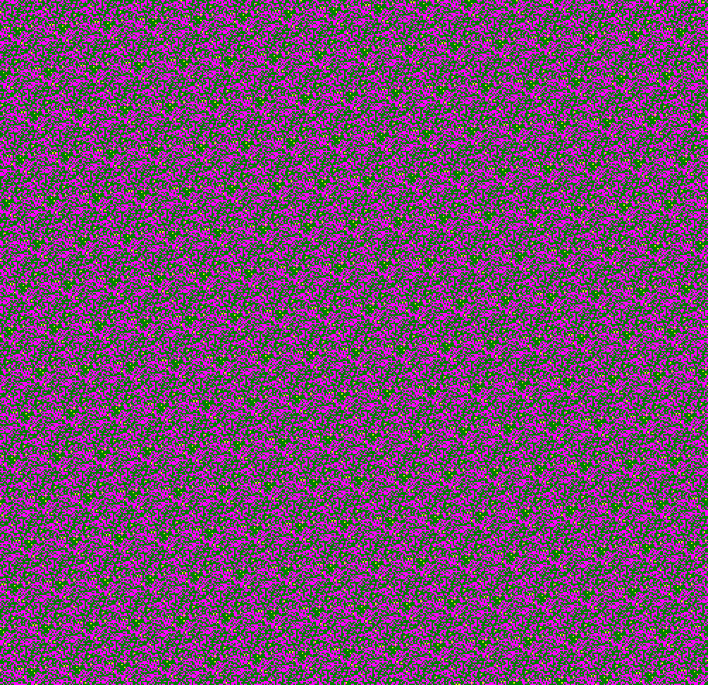
Cyclartcy: Arbitrary From Flowers RGB-MGY